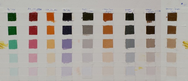
Color chart for secondary and tertiary mixtures of phthalo blue, alizarin permanent, cad orange, cad yellow medium
Sometimes when preparing to start a painting I have to put more thought than usual into the selection of colors. I've just started a small figurative painting of a child on the beach and I felt that the painting required a fresh approach on the color selection. Rather than use a lot of black in the painting I chose some colors that I thought would give me access to a wider range of warm and cool grays.
When creating a four color chart like this it's difficult to make something that's repeatable when you come to use it in practice, especially true when the colors are strong. I think the easiest way to overcome that problem is to break down the mixing of grays into steps.
I first created mostly secondary mixtures of green, red, orange and purple which are easy to reproduce. You can see those in the first four columns. Then I mixed grays and browns from the secondary mixtures. You can see those in the five columns on the right - for example, the cool grey is made from the green and red mixed together, the orange grays are made from orange, red and purple and the neutral grey is made from purple and cad yellow medium.
As usual, the color chart is painted with a palette knife on scraps of canvas taped to a board. When the paint is dry I'll glue the strips to a file divider and put it in a file with all the others.
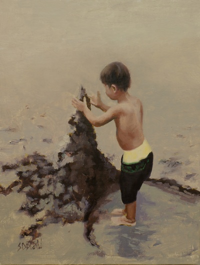
This is the painting I subsequently created:

Alex. 12x9, oil on linen panel. 2014.