A mix of simplification, mood, and light can be used to produce a painting in a style called tonal impressionism. That's a fancy way of saying that it's mainly about the dark/light shapes but uses a palette of bright colors.
In this blog post I'm going to try a couple of paintings in this style and compare them with one by Charles Warren Eaton to see what I can learn.
A tonal impressionist painting works best when it's done into the light (because it enhances the value contrasts) and when there aren't strong color contrasts in the sky (because the light unifies the colors). At first glance that would seem like an easy way to turn almost any landscape into a more dramatic painting.
To start, here's a painting that I painted after a walk at sunset, armed with a camera.
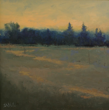
Sunset Over the Olympic Peninsula. 12x12, oil on linen panel. 2016.
The thing I particularly wanted to go after here was the contrast between the orange light and the mass of blue shadows. I used the trees as visual props to make the painting more interesting, but otherwise there wasn't much going on except for the light show.
I revisited the painting a few times to make changes in the foreground—mostly these were just small tweaks to the temperature contrasts—but it never came together as a whole.
With the benefit of hindsight, it's clear that there are a few problems with this painting:
- The land part is too dominant given the lack of anything in the foreground
- The sky area is very uniform
- The transition from blue trees to orange sky doesn't feel right
For a better visualization of what could be done better, let's compare it to one by Charles Warren Eaton (an early 20th c. painter from California who was a leading painter in the tonal impressionist movement):
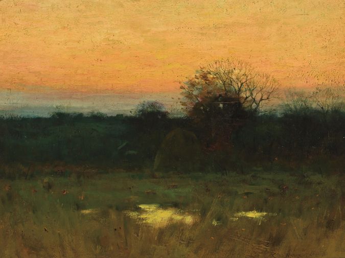
This is a stronger image than mine. It has a warmer palette, a better allocation of painting real estate to the sky and some interest in the foreground. This is not the only painting by this artist which has light reflecting on pools of water, which tells me that he found it to be a good prop.
Last, but not least, there is a nice gradation of the colors and values in the sky, all without making the lightest values too cool.
My first impression was that this was done entirely with an analogous color palette, but then I realized that the treeline uses a cooler set of colors. He's done this to create depth.
If I had to choose one thing that I don't care for, it's the way the bare tree is rendered—it doesn't seem to fit with the rest of the painting in the way that it interacts with the light and it gives the whole thing a sense of gothic foreboding. It's a small quibble, though.
There's lots to think about here, so let's have another go.
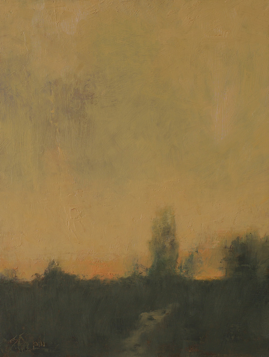
Sunset Meadows. 12x9, oil on linen panel. 2017.
I incorporated some of the above lessons into this new painting.
The most important thing I did was to simplify, simplify, simplify. Over the course of several revisions I removed almost all the detail and I made the foreground very indistinct except for the hint of lighter value that represents a path.
I also changed the way that I handled the light: I scumbled over the sky and treeline to make them appear diffuse. The atmospheric effects give the painting a more contemporary feel.
What I came to realize as I worked on both these paintings is that tonal impressionism isn't as easy as it appears to be: you need a good eye and a deft touch to bring out those small color shifts; and the light/dark edges are as difficult as ever. My initial assumption about this being an easy way to turn any landscape into a dramatic painting was dead wrong.
My other great revelation was that every tonal impressionist painting you've ever seen has been nearly 100% invention. Even though the initial idea for both of my paintings came from my own photos, I did almost all the work from imagination. In real life scenes these scenes appear totally different to the observer, if they ever really existed at all.
That's the hardest type of painting I know.