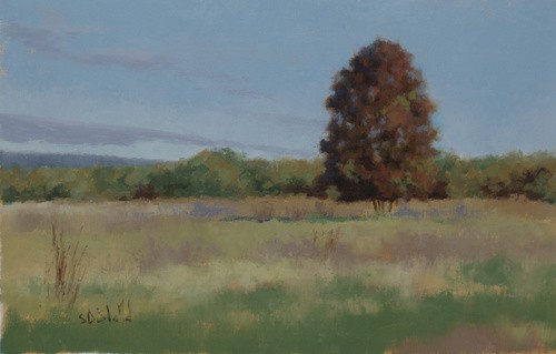
Another landscape with reworked sky
Simon Bland: 08 Dec 2012

This is another landscape study with a re-worked sky. I broke up the flat expanse of blue sky by adding in some cloud formations which were there in real life, but had been omitted when I first painted this scene. The underlying gradation of value and chroma in the sky gives a very realistic look.
I also re-worked the main tree to give it better form and make it feel less dense. Slightly lighter values at the crown as well as a touch of blue in the shadows helped create a sense of three-dimensionality.
The foreground was painted in a total of three layers. I worked back and forth with color until finding a look that let the tree be the center of attention.
Simon Bland: 08 Dec 2012