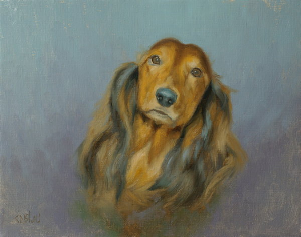
Another Portrait of a Long Haired Dachshund
Simon Bland: 19 Apr 2017

Tootsie. 11x14, oil on linen. 2017
I've just finished a second version of the portrait of Tootsie, this one done from head-on rather than from the side.
Although the photo reference I used was a poorer quality than the first, I think the color scheme and temperature of the light (cool light/warm shadows) made it easier to turn into a painting. All I had to do to make the painting pop was to find a way to liven up the background - I did that through simple value and temperature variation.
The palette used was burnt sienna, ultramarine blue, viridian, alizarin permanent, yellow ochre and cad yellow medium, plus white. The viridian/alizarin/yellow combination is a great way to create grays that can be shifted warm or cool by varying the relative proportions of the component colors (the downside is that it's a little oily!).
Simon Bland: 19 Apr 2017