Closing Out The Year: Fall 2021
Simon Bland: 29 Dec 2021
I haven't spent as much time writing blog posts in 2021 as I have in previous years, but that doesn't mean I have been quiet in the studio. I spent a lot of time this year doing new work, trying out different techniques, re-doing some old paintings and even taking on commissions.
I'm going to close out this year with a small sample of things I've worked on in the fall. Since I started walking every day along the edge of Puget Sound, my Seattle work has increasingly focused on the water. For landscape work, I've found myself reaching out through tools like Google Street View and my photo collection to put myself back in other, familiar haunts.
In November and December, I also started doing some experiments with still life. More on those in a future post.
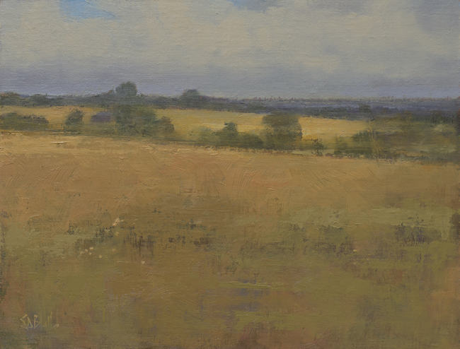
The Road to Leyburn. 9x12, oil on linen panel. 2021
This is a virtual paint out of an English countryside scene based on Google Street View. It's the area where my grandmother's family is from, and these country lanes were part of my great grandfather's postal route.
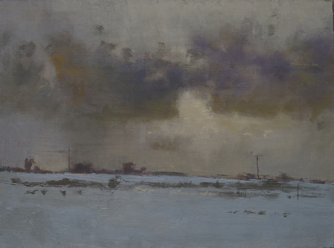
Blanket. 8x10, oil on linen panel. 2021
This started from as a sketch based on a Google Street View close to where I'm originally from in Yorkshire, UK. As it progressed, I revised the painting completely, taking out a building, adding some clouds and changing the season from summer to winter.
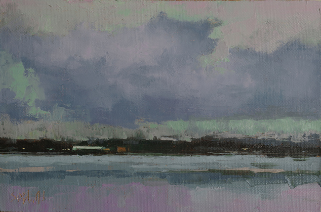
Fisherman's Terminal. 7x11, oil on linen panel. 2021
This was done as a Plein Air Washington Artists (PAWA) meetup in September. It was my first paint-out in more than two years and it showed just how out of practice I was. I started out doing everything wrong such as standing in direct light, trying to take on too much and using a tricky color combination. After I got most of the canvas covered, I turned around to face away from the scene, sat on the quay wall and re-worked large parts of the painting on site.
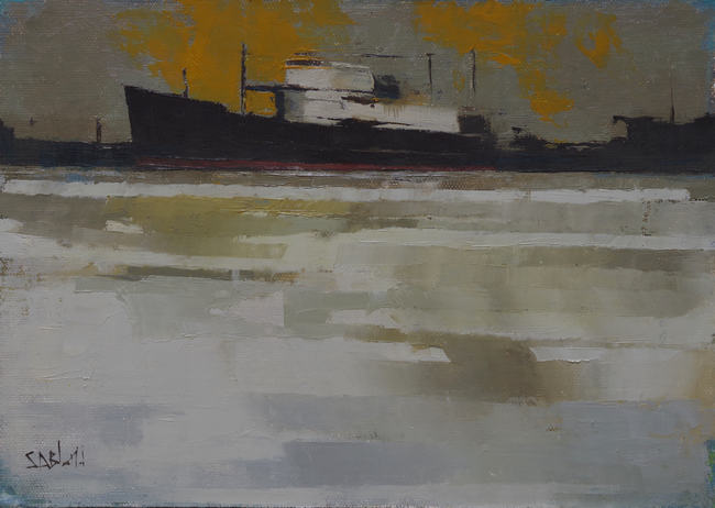
Blue Pacific. 9x12, oil on linen panel. 2021
This has been an on-going project ever since I first visited the Fisherman's Terminal in 2016. I initially did a little throw-away sketch that I loved, but it took a long time to make it work in a larger size.
It was such a demanding thing to paint without turning it into a portrait of a boat. To get unstuck, I tried to get rid of as much blue as possible (it dominated the reference photo) and worked with a simple earthy palette. Moving the boat to the top of the canvas helped to bring the focus more on to the structures in the water.
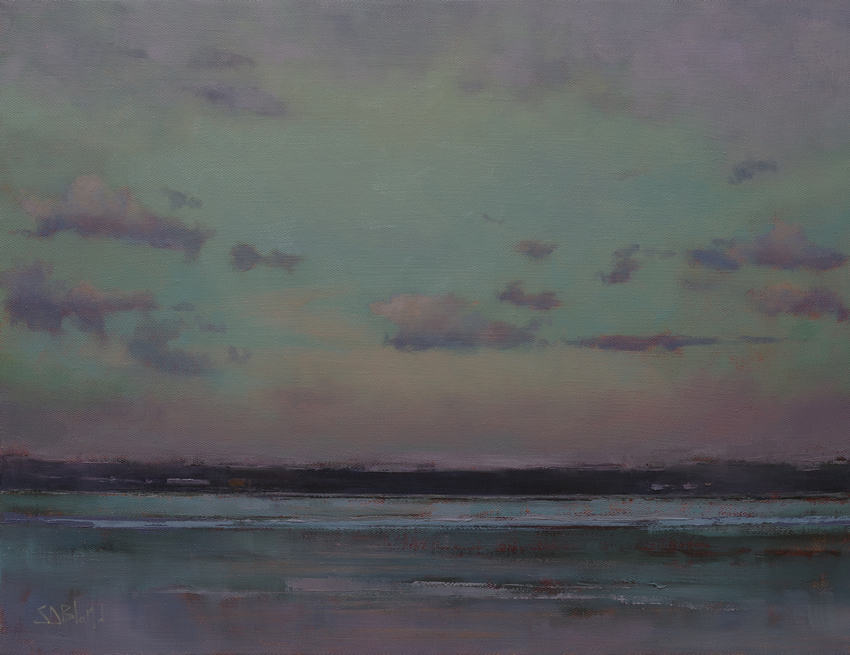
Blue Tide. 16x20, oil on linen. 2021.
This painting completes a series of larger pieces that I've done to describe the light over Elliott Bay and Puget Sound. I walk with my dog along the cliffs every day and the views are sometimes spectacular, sometimes dull, but always make me want to describe the experience with paint.
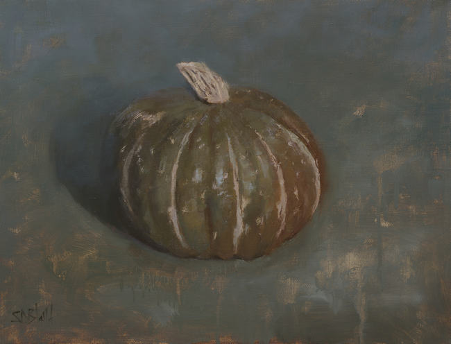
Buttercup. 14x18, oil on linen. 2021.
In the fall, I like to choose a pumpkin or two as candidates for a painting. This year, I picked out a winter squash and didn't make a note of what kind I bought (although I later learned it is either a Buttercup squash or a Kabocha).
I used an oil primed Richeson Caravaggio linen for this one and I felt like I was fighting the surface the whole way through—it claims to be a fine linen but is very textured. I usually add an extra layer or two of oil primer to it to make it more usable but didn't in this case. The surface was so hard to use that I resorted to doing abstract washes in the foreground to save myself from more painting.
Simon Bland: 29 Dec 2021