Finding a Center of Focus and Adding Interest to a Painting
Simon Bland: 26 Jan 2017

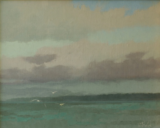
View Across to Edmonds. 11x14, oil on linen panel. 2017.
This painting is based on a small plein air study from last winter. It was a cold day and windy enough to blow over my easel onto the rocks; I ended up doing the sketch on a setup that was held together with string. The original sketch was about the light in the sky and the way that the low dark clouds were moving against the high overcast.
To make the larger painting more interesting, I decided to add some birds in the foreground. I thought that creating an enhanced area of interest would be a simple thing to do, but it actually caused the painting to change in unexpected ways. Some extra work was needed to save the picture.
The decision to add some birds was a simple one; the larger painting was too empty when it was first created: without the spontaneity of the sketch, and with tighter brushwork, it felt dull. After some thought I decided to add the birds; I had a great reference photo that just needed to be flipped horizontally to match the light direction. All three birds came from the same photo.
Placing the birds in the picture was easy. I knew they needed to be near the horizon line as that's how I always see them in flight at the shore. For horizontal placement I decided to put them on the left side flying out of the picture. That may seem like a strange choice, but it more closely matches how they behave - they usually fly out of my field of vision, not in to it.
As soon as I added the seagulls the painting was fundamentally changed. The center of interest was no longer in the background, it was now in the foreground. And the painting was no longer about the light in the sky, it was about the birds. Suddenly, the whole picture was out of balance; a dark strip of land on the right no longer made any sense, and the dark clouds offered too much contrast against the sky.
To fix the problem I re-painted all the dark areas in the background to make them lighter. Some of that was done by scumbling (a thin semi-transparent glaze that contains white) and some by covering with thick paint. Once complete, everything finally fell into place.
I think the lesson to take away from this is that sometimes you can't add things to even one part of a painting without creating knock-on effects that have to be taken into account everywhere else.
Simon Bland: 26 Jan 2017