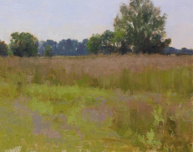
How to Paint Green Landscapes
Simon Bland: 18 Dec 2017
If you Google "green landscape painting" you'll find two types of images: ones where the artist has struggled with the colors, and ones where the artist has clearly found a better approach. For most of the history of art green has been treated with a great deal of trepidation and a quick browse through these images will show you why.
Mixing greens for landscape painting is an art unto itself and the color choices that you make can have a profound impact on your work. In this blog post I show some ways to paint landscapes without using out-of-the-tube greens along with strategies for using greens more effectively. The suggestions I provide can be applied to any style of painting.
The Problem
When we first collide with nature as an artist, we soon learn that the landscape is not how we imagine it to be from the safety of our studio. All this green is a problem: it can be the most intense color in the landscape and one of the darkest, in fact our ability to see variations in green far exceeds our ability to create it in paint.
I have struggled with this problem as much as anyone. An obvious solution is just to paint something else, yet I've been to many locations where the green was inescapable—on an overcast spring day it even permeated the air. I realized that I needed to meet the problem head-on and find ways to deal with it.
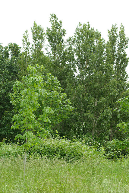
In the spring and summer some landscapes look like a salad bowl
What Are You Trying to Achieve?
To master this problem, you need to step beyond the beginner-level solutions like adding a complementary color to your greens. Ideally, you need a good strategy, and for that you first need to think about intent.
What are you trying to achieve with your painting?
For me, the most important thing is to capture the experience of being at a location. I want to create interesting paintings with good color harmony, but I'm not terribly bothered about whether they look like an actual place. I'm more concerned with light and value relationships than I am with reproducing colors.
Understanding this helps me when I start a painting. It makes the "green problem" easier because I don't feel the need to make an exact copy of what's in front of me. I always allow myself the freedom to create my own interpretation of a scene.
If, on the other hand, you set out to make an accurate copy of the actual landscape, the "green problem" can often be the single hardest part of your painting.
Whatever your approach, here are some of the ways in which you can get better outcomes:
The Landscape Painter's #1 Route to Success: Mix Your Greens
Although your first instinct might be to attack the salad bowl of vegetation with an array of exotic tube greens, it turns out that they don't help in making sense of the madness. They get in the way of reducing the color intensity and, since we use them in just one part of a painting, they make it hard to achieve good color unity.
The best solution is to mix your greens.
This may require you to question what color palette to use for a green landscape. And mixing greens for a landscape painting does takes planning and thought—for best results you shouldn't just reach for the nearest blue and yellow.
I struggled in my first few years of plein air painting until I stopped trying to shoehorn viridian and cadmium yellow or ultramarine blue and cadmium yellow into every painting. When I added chromatic black and some paler blues, the new color combinations worked much better for the types of painting I wanted to create.
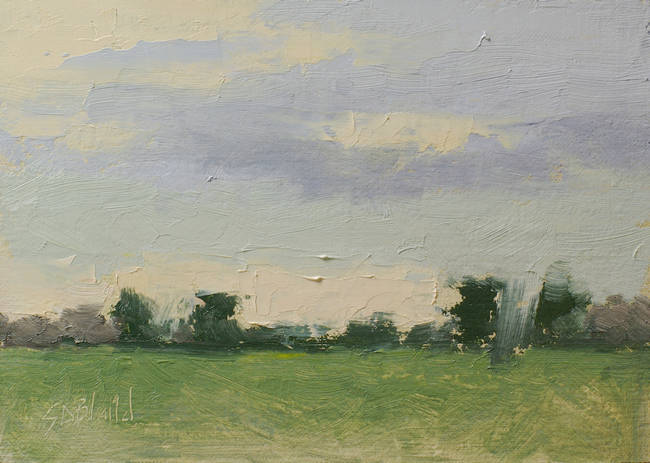
Alternative ways to mix green [Holbein violet gray, chromatic black, lemon yellow, bright red]
Mixing violet gray and lemon yellow created a green unlike any other I'd tried. Slightly transparent and gray, it was a good foundation on which to build this little on-location sketch. I added those same two colors to all other parts of the painting.
Use a Limited Palette
It's a natural step to take this way of thinking one step further and use a more restricted palette of colors.
When equipped with some colors that make a useful green just a handful of extras should be enough to get you through most landscape paintings. I think of a "limited palette" as having five or fewer colors. In the example below I worked with a total of three.
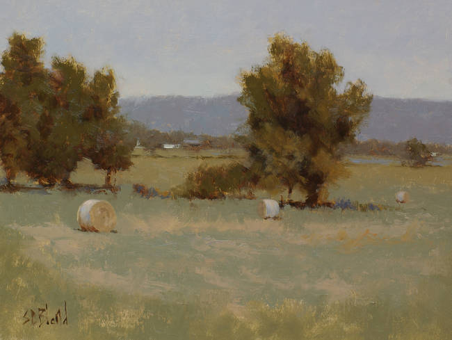
A simple family of colors brings a feeling of unity [Chromatic black, burnt sienna, lemon yellow]
The benefit of a limited palette is that it makes choices much easier so you can focus more on getting the right values. Although it forces you to compromise, you are doing so with the least important aspect of the painting.
Using it in the field requires you to plan out the painting in advance, but no more than you would with any other approach.
Break Up Areas
When you're on location a quick solution is to break up large areas of green with other colors. It doesn't require much planning out and you can easily adjust things as you go. It's also a useful way to rescue a painting when you realize you've over-used a particular color.
In this plein air study I made the greens less intense as they receded into the distance. I let the orange block-in show through in places to break up the green masses and I put violet over parts of the green field to temper the chroma.
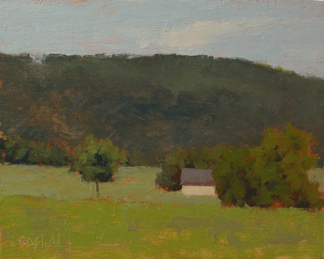
[Ultramarine blue, chromatic black, burnt sienna, cadmium yellow medium, yellow ochre, bright red]
Adding some violet and/or orange notes breaks up this area because they are split complementary colors of green (opposite on the color wheel then one step clockwise and counterclockwise).
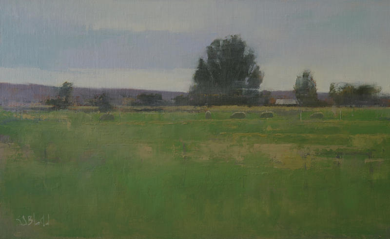
[chromatic black, permanent yellow medium and light, yellow ochre, burnt sienna]
In this studio painting, I have broken up the green in the foreground with a neutral brown and I have also varied the paint texture. The browns act like a complementary color to the green.
However, that's still a lot of green in one painting. Keep reading and we'll look at some other ways to make the painting more varied.
Divide and Conquer
We're now going to take the breaking up of areas a step further.
Instead of treating the ground as one single thing, let's break it up into a strongly delineated foreground and middle ground.
In the painting below I divided up the field in just this way: I replaced the bright foreground greens with a mix of earthy colors, and I made the middle ground a cool green. Thee's a clear dividing line between the two. Just as in the previous example, these got broken up with assorted colors.
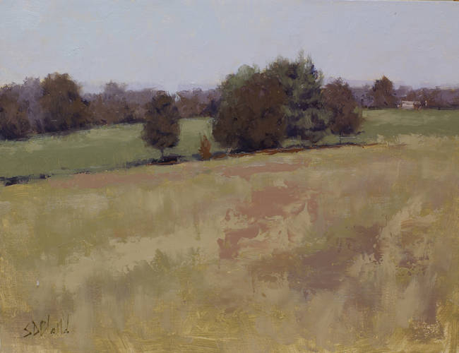
[Ultramarine blue, chromatic black, burnt sienna, cadmium yellow light, yellow ochre, bright red]
The advantage I had in this painting was that it was done in the studio from a plein air study. That gave me much more time to re-compose it, adjust the color scheme, and avoid repeating the mistakes I'd made in the field.
Here's a photograph of the painting location. You can compare the two images to get an idea of the changes I made to the colors.
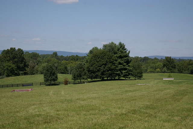
My reference photo.
In the next example, I created a warm green foreground by mixing greens with the warmer yellows and used cooler greens in the middle ground. Then I used tertiary neutral colors (pale browns and grays) painted wet-in-wet to break up these areas.

[chromatic black, permanent yellow medium and light, yellow ochre, burnt sienna]
Another design consideration that went into this painting was to make the sky relatively dark. This had the effect of making the distant barn stand out, and it also helped to make the sky feel dramatic without being a distraction.
Keep the Brightest Greens in Reserve
Because our eyes are so highly attuned to green, it can be effective to hold back and only use it sparingly in areas of importance, such as near the center of interest.
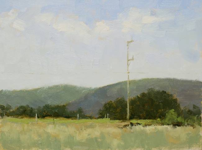
[Ultramarine blue, chromatic black, burnt sienna, cadmium yellow, yellow ochre, bright red]
At this location I searched for a long time to find something that wasn't overwhelmingly green (I'm not always so fortunate). I toned down the chroma of the long grass in the foreground and only used bright green in a horizontal stripe in the middle ground.
In this instance some yellow might have worked equally as well as the bright green. You can often substitute one for the other.
Bright Greens in the Foreground for Depth
Out-of-the-tube greens often work best in the foreground. The reason is that it supports the idea that the intensity of colors falls off as things recede into the distance. It's the reverse of atmospheric perspective in distant objects.
This also works, I suspect, because the viewer tends to overlook them and focuses on the more interesting stuff in the middle ground. We don't see much color with our peripheral vision.
In the painting below I used a Winsor and Newton color called "Green Gold" mixed with white for the most intense greens. I also broke up the area with browns and violets.
Colors appear more vivid when they are close, so bright greens in the foreground can add depth.
To be honest, I'm very wary of this bright green. I've used it successfully in two small paintings, yet I've used up most of the tube. That should give you an idea of how many failures it has caused. I keep it hidden (along with the cadmium yellow deep) at the back of my palette box where it's hard to get to.
Transform the Color Scheme
The landscape eventually provides its own solution to the green problem. As the summer wears on, grass grows and seed heads form. Summer drought brings relief in the form of oranges and pale browns, and you can eliminate green entirely from the painting yet still create something that's true to life.
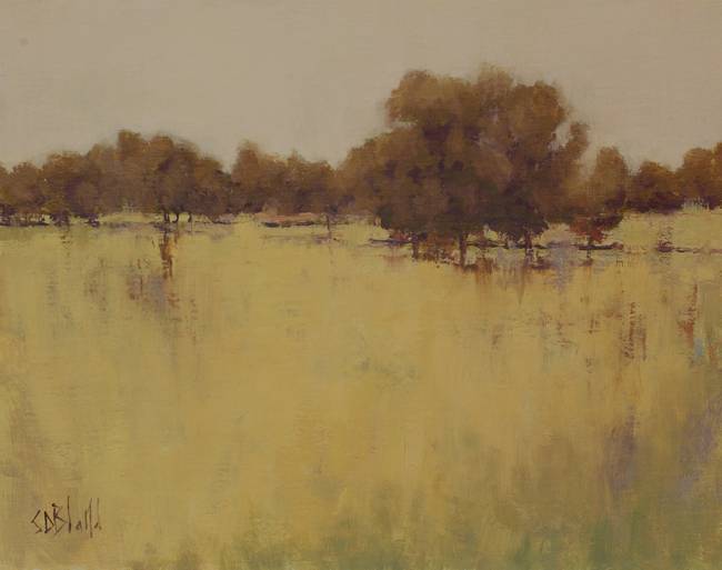
Avoiding green altogether sets a tone that's evocative of late summer.
Of course, you don't have to wait for this to happen naturally—you can simply alter your photos of green landscapes so that they are easier to paint.
Filters that remove any traces of green can be applied to a reference photo in most image editing software; however, this is a technique that's best suited for use in the studio. Trying to work from photos on your phone while on location doesn't make much sense to me.
I've found that when you start altering landscapes in the studio to reduce the green chroma, you'll gain enough experience to be able to do it on the fly while painting on location.
Change Color Palette with the Season
As spring progresses through summer and autumn, my palette shifts from being dominated by permanent yellow light to one in which permanent yellow medium takes a more prominent position. For fall paintings I shift entirely to a warm palette, and I deliberately try to avoid muddy browns.
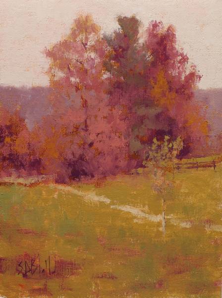
Ned Jacob palette [Phthalo blue, alizarin permanent, cadmium orange, cadmium yellow medium]
Here, I've applied the foreground in a broken texture over a warm block-in. The interesting thing about the "greens" in the foreground is that they aren't green. There are no greens in the painting. The foreground is created with a range of oranges and the "greens" in the central tree are dark red grays.
If you don't believe me, here is a sample of the main foreground color so you can see it in isolation.

This mind-bending effect is called color-constancy. Your brain is perceiving these colors as green because it knows that's what green looks like under very warm light. To make sure there's no ambiguity about the light color I also made the sky a reddish gray.
I saved this example for last because it's the most difficult green-handling technique that I know, but remarkably effective when done right.
Palette for Landscape Painting
The takeaway from this article, I think, is that there is no single correct palette for painting green landscapes (or any other type, for that matter). You can adapt any basic set of red, blue, and yellow colors to create most of the examples I've provided here. But if you are looking for a good basic palette, these are the best oil colors for landscape painting:
- Chromatic black
- Radiant blue
- Bright red
- Permanent yellow medium*
- Permanent yellow light*
- Yellow ochre
- Burnt sienna
Then you could add just one or two extra colors to suit your preference. More colors than that will make the painting process too difficult. Simpler palette choices are often better.
*Whenever possible, limit your exposure to heavy metals like those in cadmium yellow. There are plenty of alternatives available which, although they sometimes lack the opacity of the originals, are much safer for long-term use.
Recommended Reading
Unfortunately, if I remember correctly, my two favorite landscape painting books "Richard Schmid Paints the Landscape" and "Carlson's Guide to Landscape Painting" don't pay much attention to the subject of greens. Which, honestly, is rather odd.
For more reading I recommend this blog post by James Gurney (the comments are also worth reading), two blog posts by Stapleton Kearns, one dealing with summer greens and another on mixing greens, and a final blog post by Terry Miura also on mixing greens.
All three of these artists write as well as they paint, and their material is easy and fun to read (my writing is much harder to wade through). If you have any questions don't hesitate to drop me a note via my contact page.
Simon Bland: 18 Dec 2017
