Integrating the Subject of a Portrait with the Background
Simon Bland: 04 Sep 2017
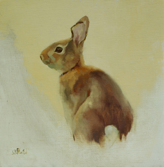
Rabbit with Yellow Background. 12x12, oil on linen mounted on panel. 2017.
You may be wondering why I didn't paint this rabbit in grass, just as I'd seen it in real life.
After all, getting the background and the subject to look like they belong together is important. It might be the biggest obstacle to making a picture look like an integrated whole. Not least, you can often create a bigger impact by painting something in its natural setting.
The answer is that, like many wild animals, rabbits wear camouflage. They are really, really hard to make out in their typical habitat. In this case, the value of the rabbit's fur was exactly the same as that of the grass behind it. If you were color blind you wouldn't be able to see it.
It doesn't make any sense to paint something like that, so we often swap real-world settings for simpler, made-up ones. Here, I left out the grass entirely and replaced it with a pale yellow. Doing this puts more focus on the subject, but it makes it harder to create the illusion of the subject being in a space.
To overcome this I used some simple techniques:
- desaturated all the colors in the picture by the same amount
- used the same palette to create the background and foreground
- used some background color in the subject
- used hard and soft, lost and found edges around the subject's outline
Desaturate Colors
I tried to get the levels of chroma about the same everywhere, except for in one or two places that I want to highlight. Since color is revealed by light, it's telling you that the light is the same everywhere.
I keep my story straight.
Use the Same Palette
This almost goes without saying, but I put it here to be thorough: all of the painting should be conjured up from the same basic set of paints. I used the same yellow in the background that I'd used in the rabbit.
Some of this picture may be imagined, but I'm consistent.
Put Background Color in the Subject
The pale yellow background is close to the subject's highlights in color and value. There are no prizes for guessing the color of this light.
Use Edges
Lost edges are used to break down the distinction between what is background and what is subject. It makes the picture feel more fluid. It makes some parts of the painting look more important than others.
With background color shared with the subject, the decision about where to have lost edges is easy to make. There are four places where I've placed lost edges around the rabbit:
- under the chin
- on the chest
- at the top of the back on the shoulder
- at the bottom of the back above the hip
Three of these were located just by looking at the color and value in the body - places where I saw the closest match with the background. Areas that are away from center of focus.
The exception was the one on the shoulder. I used a lost edge there to break up the long edge of the back.
Everywhere else the edges were painted soft. Except for the ears. I left some harder edges there to make them stand out.
Simon Bland: 04 Sep 2017