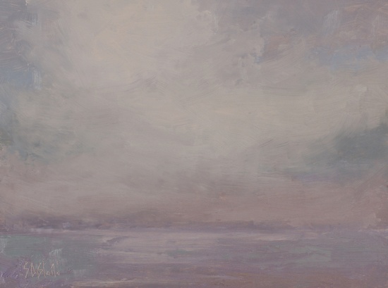
Light in the Sky - a study
Simon Bland: 08 Mar 2016

Light in the Sky - study. 9x12, oil on linen panel. 2016.
This is a study that I painted as a way to explore a different take on representing light in the sky. I based it on some plein air sketches.
Having painted landscapes in Virginia for so long, I've become used to working with the hierarchy of value relationships as explained in Carlson's Guide to Landscape Painting. The sky is always the lightest area, followed, in order, by the ground, distant mountains, and trees. When the dark landscape scenery is removed, the only thing left to bring interest to the painting is the light.
Over a winter of painting on Puget Sound I've come to realize that it's not always possible to both paint a scene realistically and get a real feeling of light. This is especially problematic when it's cloudy or overcast. It's too easy to start with a fairly high value as the darkest dark and try to work up from there. You quickly get into the problem of trying to paint the whole sky with a range of just one or two values, and it's impossible to get a great feeling of light that way.
The work-around is to start with a darker value in the sky. As you can see, I made the sky and sea the same value at the horizon (causing the horizon to be lost). In this type of bottom-up approach to the values, I know I'll still run out of values eventually so there's no way I can paint carefully rendered clouds - instead I've painted more nebulous masses of light.
This is a more Turner-like approach to painting than I usually take, but it's much more effective at helping to render the feeling light diffusing through the cloud cover. Now it's just a question of whether or not I can do this in the field - that's the hard part.
Simon Bland: 08 Mar 2016