Molly Part 1: Starting With a Low Quality Photograph
Simon Bland: 07 Aug 2015
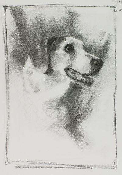
Value Design for Molly. Charcoal on a 1/2 sheet of Canson.
Artists who take commissions often get asked to work from photos that are a little off and I've seen more than my fair share of cellphone pics taken at night, or prints taken from 50 yards away with a disposable film camera. I'm usually reluctant to start a painting from photos that don't show the subject at its best, in fact I've occasionally turned down work because I didn't think I could do my best work from them.
So even though the photos I've been given for this next painting are fairly low quality, I'm actually doing it for an artist friend and I wanted to see if I could make the portrait work before dismissing it out of hand.
To get started, I've worked up a rough sketch in charcoal on a sheet of Canson paper. This allowed me to push around and rearrange the shapes of different value as I looked for a solution.
As you can see, I've structured the design based on created two main groups of values, a light and a dark. There's a small variation in each area giving about four values in total. The dark vignette serves to create a contrast with the "U" shape of massed whites in the center of the picture. It also allows for some lost edges here and there and by making an anchor for the head it helps to increase the three-dimensional look of the piece.
There were a couple of things I noted while doing the study:
- Her ear will be an important part if the portrait. It's a way to introduce lots of edge work around her eye (which will help to make that the center of focus) and by using the edges carefully it will look like it's standing out in relief.
- A little thing that the sketch is flagging for me is the area under her chin. I'll need to be careful wit the shadows there. I don't want the transition from light to dark to take attention away from the rest of her face.
With the sketch done, I feel more confident about taking on the portrait as a painting even though the reference photos are less than ideal. I have a better idea in my mind of how it will look once it's finished.
The color design for the painting is a whole other topic, but it seems that there's no point in introducing much color as there's little of it in the reference photo. I also don't want to use impressionism in the whites and tonalism in the darks. All together that suggests that I'll probably make it close to monochromatic and I'll be able to skip doing an involved color design and go straight to the painting.
Simon Bland: 07 Aug 2015