Sketch Marathon Day 22: Listening to Obscure Podcasts
Simon Bland: 27 May 2016

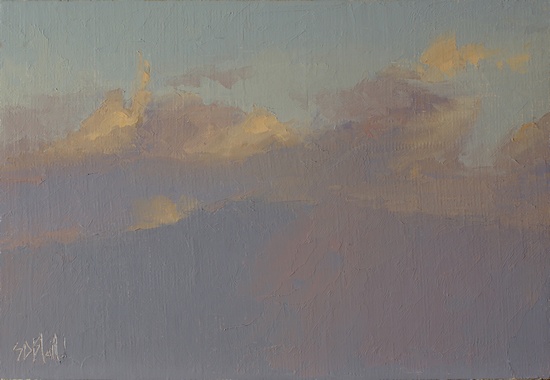
Ascent. 6x9, oil on linen panel. 2016
It was interesting to find how little color was needed to make this sketch work. I was expecting my palette to look like a peacock, but it ended up being full of grayed-out and browned-out piles of paint. The value range is just two or three value steps, I think.
The palette used was ivory black, viridian, cad orange, cad yellow medium, ultramarine and alizarin permanent. The blue sky is actually painted with ivory black and viridian.
I started this from a reference photograph that I'd taken many years ago. Working in the studio I made a leap of imagination and transformed part of the cloud structure into a mountain. The actual landscape in the photo was much, much darker (and bluer). Obviously, what I was going after here was to find a way to represent the shape of the mountain without painting it too explicitly. I've used small value and temperature shifts in a few places to do that. The value of the mountain has been made the same as that of the cloud bases - a simple way to bring unity to the picture.
Simon Bland: 27 May 2016