Some Fall Studies - Exploring Color in the Fall Landscape
Simon Bland: 03 Nov 2016
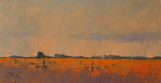
Fall Study I. 5x10, oil on linen panel. 2016
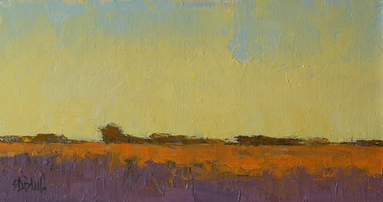
Fall Study 2. 5x10, oil on linen panel. 2016
These are a couple of studies I've done to explore some ideas for a new painting. I'm trying to create something that will fit a frame that's currently on an older, unsold work.
Since I had some opportunity to play around, I made the most of it by putting some lesser-used colors on the palette. The first was painted with cad scarlet, cad yellow deep, Holbein violet gray and Gamblin's torritt gray. The second was done with ultramarine, alizarin, cad scarlet and cad yellow medium.
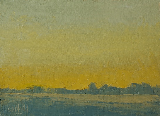
Fall Study 3. 5x7, oil on linen panel. 2016
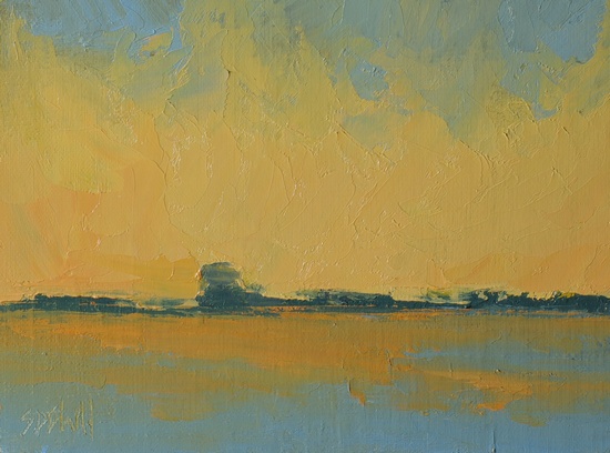
Fall Study 4. 5x7, oil on linen panel. 2016
The second pair are further variations on the same theme, but done on standard size panels.
As I worked on these it became very clear why I don't use cad yellow deep in my standard palette; it doesn't mix well with blues. It seems to be happy in a palette of analogous colors, mixing well with cad scarlet and cad yellow medium, but it has difficulty playing nicely with friends from the other side of the color wheel. Slime-green mud? Yes, we can do that.
My other problem with cad yellow deep is that when it's used to mix greens the resulting color varies under different light sources. I've made a perfectly good mixed green under the studio lights which looked brown under natural light. That's not something you want to have happen because you never know where a customer will hang a painting.
Simon Bland: 03 Nov 2016