Still Life Paintings: Late 2020
Simon Bland: 15 Dec 2020
In the past few years, I've found that still life painting offers both a welcome change from the usual landscape and portrait fare and is a wonderful way to practice technique.
In this blog post I show two of my recent still life paintings done before and after the thanksgiving holidays.

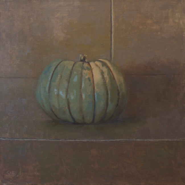
Blue Doll. 24x24, oil on hemp. 2020.
As a rule, I don't think that pumpkins always make good painting subjects, but I was so taken with this blue doll pumpkin that I bought it just to paint it.
However, my studio isn't great for still life painting—everything is up against the walls, the easel is far too big, I don't have great props lying around, and so on. I set up the pumpkin on a cardboard backdrop on the stand where I normally keep my monitor and worked sitting down at an A-frame easel in the center of the (ridiculously small) room.
It was a lovely change to do such a simple painting from life on a bigger canvas.

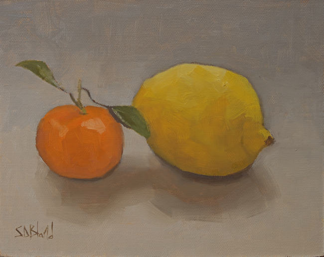
Untitled. 8x10, oil on linen panel. 2020.
I painted this next one as an exercise—which is another way of saying this is not a carefully composed set-up.
Along the way, I discovered just how helpful it was to pick up and handle the fruit. Mandarins and lemons have irregular shapes: they have facets and imperfections, ridges, and dimples. Putting your hands on them makes you much more aware of their shape than simply staring at them.
Disappointed with the first few attempts, I started it over four or five times while using the same rough block-in, underpainting and palette each time.
The biggest difference between this and the previous attempts is that I changed the illumination. I turned off the desk lamp I had been using in favor of natural window light. It became much easier to translate the values I saw into those I created on the canvas.
For the lemon, this was also my first outing with Rembrandt Permanent Yellow. I'm trying it out as a replacement for Gamblin Hansa Yellow (which has a green tinge) and Cadmium Yellow (which is based on a heavy metal). My first impression is that the paint is slightly oily and semitransparent. It doesn't have the same covering power as cadmium yellow, but the color itself is splendid.
Simon Bland: 15 Dec 2020