Wind Field Farm (plein air and studio work)
Simon Bland: 02 Sep 2015
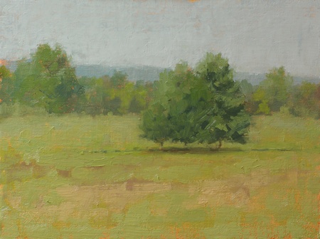
Wind Field Farm (plein air). 9x12, oil on linen panel. 2015
As September arrives the colors of the sky and landscape start to transform and the yellows get darker. It's tempting try and convey the sense of early fall by adding orange to all the paint, but that doesn't always work out well; I toned the canvas a red-orange instead.
I keyed the values off the shadows in the trees. They appeared lighter than usual as there was a lot of atmospheric haze between me and them. The result was to raise the key of the whole painting.
This was painted on a 90 degree, 70% humidity day. Fortunately I was standing in the shade at the top of a hill where there was a strong breeze blowing. I chugged a couple of liters of water as I worked. For a nice change, my easel didn't blow over!
If it hadn't been so hot I would have been happy to stay there all day, pitch a tent and sleep there as well. It was a beautiful place.
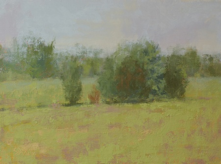
Wind Field Farm (plein air with abstract effects). 9x12, oil on linen panel. 2015
After a few weeks back in the studio the plein air work had already made it to the reject pile; I didn't see much in it to make it worth putting up for sale. Instead I used it as a vehicle to practice working in a more abstract style. I sanded down the sky (where the paint was too thick) then painted new layers on top of the old paint. It was fun to see how far I could push the effects and still retain some semblance of realism.
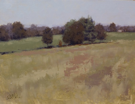
Wind Field Farm (studio). 11x14, oil on linen panel. 2015
I also used the plein air as a study for a larger studio painting. I thought it would work better with a different palette and a color scheme that has a lot less green in it; I used chromatic black, alizarin permanent, cad orange and cad yellow medium.
The resulting painting is completely different beast from the plein air work. Even though the colors in the first painting are closer to how they appeared in real life, the new work with the adjusted colors looks more real. I think the main reason is that the value relationships have been worked out more carefully.
The design is also more interesting.The darker values in the stand of trees makes a stronger center of interest and the building in the distance breaks up the monotony of the tree line. The foreground textures have also been enhanced. All things considered it was a challenge to create something out of so little.
Simon Bland: 02 Sep 2015